Colours & shades
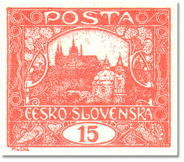
The shades of the 15h are still the subject of serious debate. Catalogues distinguish five basic shades, whose occurrence is tied to groups of printing plates.
| Shade | POFIS | MERKUR | Printing plates |
|---|---|---|---|
| brick red | 7 | 7 | Plates I, II, VII |
| brownish red | 7a | 7a | Plates I, II, VII |
| red | 7b | 7b | Plates I, II, VII |
| carmine / carmine red | 7c | 7c | Plates V, VI |
| vermilion | 7d | — | Plates III–VI |
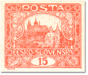
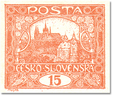
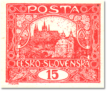
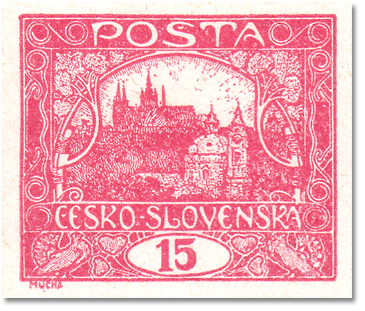
Telling the shades apart under a UV lamp
Colour is the hardest attribute of this value to pin down. František Beneš counted that over three quarters of a century the specialist literature used some twenty-one different colour terms for this single 15h stamp — from brick red through orange-red and vermilion to carmine and red-brown. The reason is prosaic: a large print run, a long production period and post-war shortages that kept making the suppliers change their ink formulations.
Beneš therefore examined thousands of stamps under an ultraviolet lamp, judging each one in three views at once: in daylight, under UV at 366 nm (blue tube) and at 254 nm (clear tube). The result is a survey of seven observed groups.
| colour in daylight | UV 366 nm (blue tube) | UV 254 nm (clear tube) | |
|---|---|---|---|
| 1 | very pale red | light violet or brownish violet | light violet |
| 2 | light red | brown-violet | light to dark olive brown |
| 3 | brick (orange) red | brilliant light red | carmine 7 |
| 4 | brick (orange) red | dark red | brownish violet or carmine |
| 5 | light red | light to dark violet 8 | light to dark violet 8 |
| 6 | dark red | dark violet | blackish violet 9 |
| 7 | carmine | dark violet | violet 10 |
To make the UV shades easier to picture, Beneš compares some of them to the well-known daylight colours of other values of the issue: 7 roughly the 20h carmine (Pof. 9) · 8 roughly the 30h light resp. dark violet (Pof. 13 and 13a) · 9 roughly the 25h blackish violet (Pof. 11) · 10 roughly the 25h violet (Pof. 11).
What the table tells us
The most important thing is what the table does not show at first glance. Groups 3 and 4 have exactly the same daylight description — brick (orange) red — yet under 366 nm they separate into brilliant light red versus dark red. The same goes for groups 2 and 5: both are „light red“ in daylight, but brownish violet versus violet under the lamp. In other words: UV separates shades the eye cannot separate in daylight. That is the whole point of the lamp.
The second reading concerns group 1. In the second part of his study Beneš points out that the colour of this stamp can be altered by physical and chemical influences, but the change practically always goes towards lighter, never darker. A pale red copy glowing violet under 366 nm is therefore far more likely to be a damaged ordinary stamp than a rare shade.
And a note of caution: the seven observed groups are not catalogue entries. Beneš describes what he saw, not what should be catalogued — his article contains no mapping onto 7, 7a, 7b, 7c and 7d, and none can be inferred.
This also suggests a way of testing the reflection on carmine 7c in the next section: compare, under 366 nm, a credibly documented unused vermilion copy with a soaked carmine one. If it really is the same ink secondarily altered by heat, the UV behaviour should show it.
How to work with the lamp
The working wavelength is 366 nm; 254 nm serves as a cross-check and calls for eye protection and short exposure. Absolute judgement of colour under UV is unreliable, comparative judgement works — so always keep a reference copy of a known shade in the field of view. Work in complete darkness, at a constant lamp distance, and give a mercury tube a minute or two to settle. If you want to photograph the shades, keep white balance and exposure fixed — otherwise the images are not comparable with each other and the whole exercise is wasted.
What UV does not tell you about colour
Paper from 1919 contains no optical brighteners. So if the paper itself glows blue-white under the lamp, that is not a statement about shade — it means later paper, a repair, regumming or a filled thin. A useful finding, but the answer to a completely different question than the colour of the printing ink.
Source: František Beneš, The colour of the 15 heller Hradčany stamp of 1918 (parts I and II).
The five catalogue shades under the UV lamp — a practical key
Beneš described what he saw under the lamp and deliberately did not translate it into catalogue letters. In 2013 Marek Vrba went the opposite way: he took the five shades listed by the Pofis handbook and for each one wrote down how it looks in daylight, how it looks under the 366 nm blue tube and which printing plates it comes from. It is the closest thing to a usable key that the literature offers. Vrba stresses that his findings apply above all to stamps with original gum.
| shade | Pofis | daylight | UV 366 nm | printing plates |
|---|---|---|---|---|
| brick red | 7 | light | light, at most slightly darker — it “glows” | I, II, VII |
| brownish red | 7a | deep to dark brick red | dark brown — it does not glow | I, II, VII |
| red (formerly “reddish brown”) | 7b | red to deep red | dark brown to blackish brown — does not glow | I, II, VII |
| carmine | 7c | identical to the 20h Hradčany (Pof. 9) | dark carmine | V, VI |
| vermilion | 7d | a livelier shade of brick red | light — it “glows” | III–VI |
The table yields one rule worth carrying in one’s head: the expensive shades do not glow. Brownish red and red darken to brown under the lamp, while the ordinary brick red and vermilion stay light and “shine”. The lamp thus separates the cheap from the dear at a glance — but only with a comparison piece alongside; absolute judgement under UV does not work (see above).
The second reading concerns the plates. The first three shades occur on stamps from plates I, II and VII, so each of these plates can be documented in three shades — nine variants in all. Vrba shows them on imperforate stamps from plate VII (field 98 in brick red and in brownish red, field 61 in red) and on perforated 13¾ : 13½ stamps from field 92 of plates II, I and VII; for the other perforations the situation differs and he refers to the catalogue. Within each shade there are lighter and darker copies according to the thickness of the ink layer and the kind of paper. He found carmine on stamps from plates V and VI; the term “vermilion” is used for stamps from the single-type plates III–VI, i.e. exclusively with the open type I spiral.
Forgeries of the brownish red 7a
The second half of Vrba’s article is a warning. The brownish red 7a is so much dearer than the basic shade that chemically recoloured brick red stamps have been on the market for years. The treatment damages the gum, so the forger applies new gum. In daylight such pieces are dark brick red, sometimes with small specks in the coloured areas. Under the UV lamp the colour darkens only to a light brown, occasionally with a violet-pink tinge — never to the dark brown of a genuine 7a. The new gum is bright under the lamp, often uneven, with spots and strokes from its application; this can usually be seen at an oblique angle against the light as well.
Vrba adds that some forgeries are primitive and others accomplished — and that there are pieces which misled the experts of their day and carry their mark. He himself bought one, trusting that an expertised stamp must be genuine. With the 7a an expert’s mark is therefore no substitute for one’s own look under the lamp.
For the discussion of carmine in the next section Vrba’s key gives a concrete expectation: a genuine carmine 7c should be dark carmine under 366 nm, whereas vermilion 7d glows light. A piece that looks carmine in daylight but glows like vermilion under the lamp would therefore fit a secondarily altered vermilion better than a shade in its own right.
Source: Marek Vrba, 15 h Hradčany – rozlišení barev a postup při rozpoznávání padělků (Distinguishing the colours of the 15 h Hradčany and how to recognise forgeries), Filatelie 11/2013, pp. 10–11. Vrba himself refers to Beneš’s study in Filatelie 5 and 6/1998, on which the previous section is based. Colour reproductions in print or on screen do not match the actual stamps; they serve only for orientation.
Carmine 7c — a disputed shade? (a reflection)
The catalogues list carmine (7c) as a separate shade of printing plates V and VI. In practice, however, this shade is documented in unused condition only quite exceptionally — the vast majority of “carmine” copies passing through collections and auctions are cancelled.
I believe the explanation is prosaic: the pigment of the vermilion printings is heat-sensitive. If a certain shade of a vermilion stamp is exposed to higher temperature — typically when stamps are soaked off covers in hot water — the colour changes to carmine. This would also explain why carmine occurs almost exclusively on used stamps, i.e. stamps that were as a rule soaked off at some point in the past.
If this reasoning is correct, “carmine” would not be an independent printing shade but vermilion secondarily altered by heat. Carmine copies therefore deserve cautious judgement — especially unused examples declared as shade 7c, which I recommend comparing with credibly documented material. I welcome colleagues' opinions and material that would confirm or refute this hypothesis (pepa.matousek@gmail.com).
— the author's reflection, Josef Matoušek
Practical note
Shade attribution is most reliable in combination with plate identification: a stamp from plates III–VI cannot be brick red (7), a stamp from plates I/II/VII cannot be vermilion (7d). Plate characteristics of individual fields can be found in the position gallery.